
Wenn sich ein Kunde um 7 Uhr morgens in sein Wealth-Management-Dashboard einloggt, um vor einem morgendlichen Meeting die Portfoliowertentwicklung zu überprüfen, prägen die Sekunden zwischen dem Klick und dem Anzeigen seiner Daten seine Wahrnehmung des gesamten Instituts. Die Benutzeroberfläche im Finanzwesen ist kein nettes Extra mehr. Sie ist der entscheidende Faktor dafür, ob Kunden bleiben, weiterempfehlen oder zu einem Mitbewerber mit reibungsloseren digitalen Produkten abwandern. Jede Interaktion prägt das Erlebnis des Endbenutzers, weshalb es für Benutzer und Unternehmen gleichermaßen entscheidend ist, effektive UX-Gestaltung zu priorisieren.
Dieser Leitfaden behandelt die wesentlichen Aspekte der Grundlagen der Nutzererfahrung für regulierte Plattformen, von CRM-Systemen und
digitales Onboarding zu Portfolio-Dashboards und Kundenportalen. Unabhängig davon, ob Sie eine Privatbank, eine Vermögsverwaltung oder ein Versicherungsunternehmen leiten – das Verständnis, wie echte Nutzer mit Ihren Tools interagieren, hilft Ihnen dabei, Reibungsverluste zu reduzieren, Compliance-Anforderungen zu erfüllen und dauerhaftes Vertrauen aufzubauen. Die Verbesserung der Grundlagen der Nutzererfahrung kann zudem die Zeit erhöhen, die Nutzer auf Ihren digitalen Plattformen verbringen, was zu einer höheren Interaktion und größerem Vertrauen führt.
Was ist User Experience (UX) im Finanzwesen?
Die Nutzererfahrung umfasst den Gesamteindruck, den Kunden und Mitarbeiter bei der Nutzung eines digitalen Produkts wie eines Online-Banking-Portals oder eines Schweizer Vermögensverwaltungshaushalts bilden. Sie deckt jeden Moment vom ersten Website-Besuch bis hin zu laufenden Portfolio-Überprüfungen und Compliance-Prüfungen ab. Jede Interaktion des Endbenutzers mit der Plattform, von der Navigation bis zur Aufgabenerledigung, prägt seine Gesamtwahrnehmung und Zufriedenheit mit dem Service.
In regulierten Branchen dreht sich UX speziell um Effektivität, Effizienz und Nutzerzufriedenheit beim Erledigen konkreter Aufgaben. Zu diesen Aufgaben gehören Onboarding, KYC-Verifizierung, die Überprüfung der Portfolio-Performance oder die Aktualisierung persönlicher Daten. Die Annahme eines nutzerzentrierten Ansatzes ist bei der Gestaltung von Finanzdienstleistungsplattformen unerlässlich, da er sicherstellt, dass die Bedürfnisse und Verhaltensweisen der Nutzer priorisiert werden, was sowohl die regulatorische Compliance als auch die Nutzerzufriedenheit unterstützt. Eine starke UX-Strategie bringt Einfachheit mit strengen regulatorischen Anforderungen in Einklang, die KYC, AML, MiFID II und Datenschutzgesetze einschließlich der DSGVO und der FINMA-Erwartungen betreffen.
Die wirtschaftlichen Argumente liegen auf der Hand. Untersuchungen zeigen, dass 88% der Nutzer eine Plattform nach einer von Störungen geprägten Erfahrung endgültig verlassen, während 72% positive Erfahrungen mit mehr als fünf Personen teilen. Für Finanzinstitute Wo Vertrauen alles ist, unterstützt eine großartige UX die Kundenbindung und Weiterempfehlungen direkt.
Beispiel: Gute vs. schlechte UX bei der Kontoeröffnung
Positive Erfahrung | Frustrierendes Erlebnis |
|---|---|
Deutlicher Fortschrittsbalken, der Schritt 2 von 5 anzeigt | Kein Hinweis darauf, wie viele Schritte noch verbleiben |
Vorausgefüllte Felder aus vorherigen Eingaben | Wiederholte Anfragen für dieselben Daten |
Sofortige Dokumentenvalidierung mit hilfreichem Feedback | Unerklärliche Ablehnung eines gültigen Reisepass-Scans |
Bestätigungs-E-Mail innerhalb von Sekunden | 48 Stunden Schweigen, dann ein generisches PDF |
Positive Nutzererfahrung in einer digitalen Onboarding-Reise
Die Abbildung der Customer Journey ist essenziell, um Schwachstellen zu identifizieren und jeden Schritt des Onboarding-Prozesses zu optimieren.
Betrachten Sie einen Private-Banking-Kunden, der ein digitales Onboarding auf einem in der Schweiz gehosteten InvestGlass-Portal durchführt. Der Prozess dauert von Anfang bis Ende weniger als 15 Minuten.
Bildschirm 1: Willkommen und Identitätsüberprüfung Der Kunde sieht einen übersichtlichen Willkommensbildschirm, auf dem sein Name bereits aus der Erstanfrage vorausgefüllt ist. Eine Fortschrittsanzeige zeigt Schritt 1 von 5. Er lädt seinen Reisepass hoch, und innerhalb von Sekunden bestätigt das System, dass das Dokument lesbar ist. Ein kleiner Tooltip erklärt in verständlichem britischen Englisch ohne Fachjargon, warum die Identitätsprüfung wichtig ist.
Bildschirm 2: Persönliche Daten und steuerlicher Wohnsitz Die Felder sind logisch gruppiert. Das System erkennt das Land anhand des Reisepasses automatisch und schlägt Optionen für den steuerlichen Wohnsitz vor. Eine Inline-Validierung hebt fehlende Informationen hervor, bevor der Kunde versucht, das Formular abzusenden.
Bild 3: Eignungsfragebogen Die Fragen zum Risiko sind in klarer Alltagssprache formuliert. Anstatt nach “Schwellenwerten für die Volatilitätstoleranz” zu fragen, lautet die Frage im Formular: “Wie würden Sie sich fühlen, wenn Ihr Portfolio innerhalb eines Monats um 15% an Wert verlieren würde?” Kontextspezifische Hilfe-Symbole erklären bei Bedarf Begriffe wie “wirtschaftlicher Eigentümer”.
Bildschirm 4: Dokumentenunterzeichnung und Bestätigung Elektronische Signaturen funktionieren reibungslos auf Desktop- und Mobilgeräten. Eine sofortige Bestätigungs-E-Mail geht ein, die die nächsten Schritte erläutert und Zugriff auf einen sicheren Dokumententresor bietet.
Die Gestaltung dieser Onboarding-Prozesse unter Berücksichtigung von Nutzer-Personas stellt sicher, dass der Ablauf die Bedürfnisse verschiedener Kundentypen erfüllt und eine reibungslose Customer Journey unterstützt.
Diese positive Benutzererfahrung reduziert die Anzahl der Anrufe beim Support um bis zu 40% und motiviert die Kunden dazu, den Self-Service zu nutzen. Werkzeuge für das Portfolio Aufrufe und Aktualisierungen zur Eignung. Fallstudien zeigen, dass die Abschlussquoten von 45% auf 85% steigen, wenn Onboarding-Abläufe auf diese Weise gestaltet werden.
Frustrierende Nutzererfahrung in einem stark regulierten Kontext
Betrachten wir nun das entgegengesetzte Szenario. Ein potenzieller Kunde versucht, ein Konto bei einer Bank eröffnen nutzt immer noch Altsysteme.
Sie laden ihren Reisepass hoch, aber das System lehnt ihn ohne Erklärung ab. Nach drei Versuchen stellen sie fest, dass die Datei 100 KB über einem nicht genannten Größenlimit lag. Sie beginnen das Formular von vorn, nur um festzustellen, dass die Sitzung abgelaufen ist und nichts gespeichert wurde.
Der Risikofragebogen verwendet Akronyme wie “UBO” und “ESG” ohne Definitionen. Die Fragen sind in einer Regulierungssprache formuliert, die direkt aus der MiFID-II-Dokumentation kopiert wurde. Der Kunde rät bei den Antworten, da er sich nicht sicher ist, was sie bedeuten.
Nach dem Absenden erhalten sie keine Bestätigung. Eine Woche später bittet eine E-Mail sie darum, bereits hochgeladene Dokumente erneut zu senden. Der Anhang ist ein statisches PDF, das einen Drucker, einen Stift und einen Scanner erfordert.
Diese Art von Erfahrung führt zu Abbruchquoten von 50–70% und unvollständigen KYC-Unterlagen, deren manuelle Nachbesserung pro Fall 50–100 € kostet. In den Jahren 2024 und 2025 stützten sich viele Banken noch immer auf E-Mail-Ketten und statische PDF-Dateien, was zu Reibungsverlusten, Fehlern und Sicherheitsbedenken führte. InvestGlass wurde speziell entwickelt, um diese Schwachstellen durch schrittweise Offenlegung, Inline-Validierung und intelligente Dokumentenverarbeitung zu beseitigen.

Nutzerzentriertes Design für regulierte Institutionen
Nutzerzentriertes Design behandelt Beziehungsmanager, Compliance-Beauftragten, Endkunden und Backoffice-Mitarbeitern als primäre Nutzer, die jeweils berechtigte Bedürfnisse haben, die Designentscheidungen prägen. Dieser Ansatz geht von konkreten Zielen statt von technischen Funktionen aus.
Ein Kundenbetreuer muss möglicherweise “innerhalb von 24 Stunden ein neues Konto genehmigen”. Ein Compliance-Beauftragter muss vielleicht “alle ausstehenden KYC-Prüfungen auf einem Bildschirm sehen”. Ein Endkunde möchte möglicherweise “die Performance meines Portfolios überprüfen, ohne meinen Berater anzurufen”. Das Verständnis der Benutzerbedürfnisse durch Methoden der Nutzerforschung wie Benutzerinterviews, anonymisierte Verhaltensanalysen und die Auswertung von Support-Tickets hilft Teams dabei, Systeme zu entwickeln, die wirklich funktionieren.
InvestGlass optimiert seine Arbeitsabläufe auf der Grundlage von direktem Feedback europäischer Privatbanken und Vermögensverwalter. Dieser fortlaufende Prozess hat zu Zeiteinsparungen von 25–30% bei KYC-Prüfungen und deutlich schnelleren Eignungsprüfungen geführt. Die Plattform spiegelt wider, was echte Nutzer tatsächlich tun, und nicht, was Designer vermuten, dass sie tun könnten. Kontinuierliche UX-Maßnahmen sind unerlässlich, um in regulierten Umgebungen ein Gleichgewicht zwischen Effizienz, Compliance und Nutzerzufriedenheit herzustellen.
Typische Benutzerrollen im Wealth-Management-UX:
- Kunde: Sucht nach intuitiver Selbstbedienung für Portfolio-Ansichten, Dokumentenzugriff und sicheres Messaging
- Kundenbetreuer Benötigt schnellen Datenzugriff während Meetings, Ein-Klick-Ansichten des Risikoprofils und effiziente Anrufprotokollierung
- Compliance-Beauftragter Erfordert Audit-Trails, Stapelgenehmigungsbildschirme und klare Regulierungsstatusindikatoren
- Backoffice Verarbeitet Massendaten, Datenimporte und Ausnahmemanagement
Kernkomponenten der UX für CRM- und Kundenportale
User Experience (UX) in Finanzsoftware kombiniert klassische Elemente wie Benutzerfreundlichkeit und visuelles Design mit branchenspezifischen Aspekten wie Risikosichtbarkeit, Prüfprotokollen und Datensouveränität. Jede Komponente trägt dazu bei, wie Benutzer Informationen finden, Aufgaben erledigen und das Institut hinter der Benutzeroberfläche wahrnehmen.
Die folgenden Unterabschnitte gliedern die Schlüsselelemente auf, auf die sich UX-Designer beim Erstellen von CRM-Systemen, Onboarding-Formularen und Portfolio-Dashboards für regulierte Umgebungen stützen. Alle Erklärungen beziehen sich auf reale Kontexte wie MiFID-II-Anforderungen, FINMA-Erwartungen und ESG-Berichterstattungsanforderungen.
Benutzerfreundlichkeit
Die Benutzerfreundlichkeit bestimmt, wie einfach ein Kundenbetreuer oder Kunde Kernaufgaben wie das Protokollieren von Anrufen, das Aktualisieren von KYC-Informationen oder das Signieren von Dokumenten erledigen kann. Ein benutzerfreundliches System verfügt über eine klare Navigation, ein konsistentes Formularlayout und tastaturfreundliche Arbeitsabläufe für intensive tägliche Nutzer.
Konkrete Beispiele für hohe Benutzeroberflächen-Gebrauchstauglichkeit umfassen:
- Zugriff mit nur einem Klick auf das Kundenrisikoprofil direkt vom Portfolio-Bildschirm aus
- Eine einheitliche Zeitleiste, die alle Interaktionen, Dokumente und Compliance-Ereignisse an einem Ort zusammenfasst
- Inline-Bearbeitung von Kundendetails ohne Wechsel zu separaten Bildschirmen
- Tastenkombinationen für häufige Aktionen wie Speichern, Suchen und zum nächsten Datensatz wechseln
Als eine mittelgroße Schweizer Bank von Tabellenkalkulationen und gemeinsamen Ordnern auf InvestGlass umstieg, berichteten die Kundenbetreuer, dass sich der Zeitaufwand für routinemäßige Kundenüberprüfungen von 2 Stunden auf 20 Minuten verkürzt habe. Benutzerfreundliche Systeme reduzieren den Schulungsaufwand für neue Mitarbeiter um bis zu 50% und senken das Risiko von Betriebsfehlern, die zu Verstößen gegen regulatorische Vorschriften führen könnten. Gemäß der DSGVO können Bußgelder bis zu 10 Millionen Euro oder mehr betragen, wodurch die Benutzerfreundlichkeit nicht nur ein Effizienz-, sondern auch ein Compliance-Thema ist.
Informationsarchitektur
Informationsarchitektur beschreibt, wie Einheiten wie Kunden, Haushalte, Portfolios, Dokumente und Aufgaben in einem System strukturiert und verknüpft sind. Eine klare Hierarchie hilft den Mitarbeitern, Beziehungen zwischen ultimativen wirtschaftliche Eigentümer, Konten und Mandate, ohne sich durch unzusammenhängende Bildschirme wühlen zu müssen.
In einem InvestGlass-Arbeitsbereich könnte die Struktur in Worten wie folgt aussehen:
Kundenakte (oberste Ebene)
- Registerkarte: KYC-Dokumente (Kopien von Reisepässen, Adressnachweis, Herkunft des Vermögens)
- Registerkarte: Portfolio (Bestände, ESG-Scores, Performance-Charts)
- Registerkarte: Dokumente (Vereinbarungen, Korrespondenz, unterzeichnete Formulare)
- Registerkarte: Kommunikation (Anrufprotokolle, E-Mails, Besprechungsnotizen)
- Register: Risiken (MiFID-Fragebogenantworten, Risikoprofil, Eignungsstatus)
Diese logische Informationsarchitektur unterstützt sowohl die tägliche Arbeit als auch behördliche Prüfungen. Wenn ein Compliance-Team alle KYC-Unterlagen für ein bestimmtes Kundensegment exportieren muss, kann es dies schnell erledigen, anstatt in mehreren Systemen danach suchen zu müssen. Studien zeigen, dass eine gut organisierte Informationsarchitektur die Suchzeiten um 60% verkürzt, in Vermögensverwaltungs-CRMs.
Interaktionsdesign
Interaction Design bestimmt, wie das System reagiert, wenn Benutzer Portfolios filtern, Workflows genehmigen oder elektronische Dokumente signieren. Gutes Interaction Design minimiert Klicks für Kundenbetreuer, die täglich Hunderte von Aktionen ausführen. UI-Design spielt eine entscheidende Rolle dabei, sicherzustellen, dass visuelle Elemente und Interaktionen konsistent und optisch ansprechend sind, die Benutzerfreundlichkeit verbessern und die Markenidentität stärken.
Ein typischer Tag für einen Kundenbetreuer, der InvestGlass verwendet, könnte Folgendes beinhalten:
- 8:30am: Log a client call. The system auto-timestamps and adds the entry to the client timeline without extra steps.
- 9:15am: Update KYC details. Inline validation immediately flags incomplete fields with clear messages.
- 10:00am: Review pending approvals. A batch screen shows all items requiring action with smart defaults applied.
- 2:30pm: Sign documents with a client. Touch-friendly signature capture works smoothly on an iPad during the meeting.
- 4:00pm: Run a portfolio filter. Real-time charts update as currencies and date ranges are adjusted.
Micro-interactions matter too. Loading spinners for large portfolio calculations reassure users that something is happening. Instant AML screening feedback badges show green, amber, or red status without requiring a separate check. These details reduce cognitive load and prevent users struggle with uncertain system states.
Visuelles Design und Vertrauenssignale
Visual elements influence perceptions of stability and trust in regulated sectors. Typography, colour, and spacing all contribute to whether clients feel confident or anxious when using a platform.
Effective visual design for private banking typically includes:
- Calm, restrained palettes (navy blues, soft grays, muted greens)
- Sans-serif typography at 14-16pt for readability
- Strategic white space that prevents screens feeling crowded
- Clear status badges showing KYC completeness or risk levels
Before and after example:
A cluttered dashboard showing 12 KPIs in a dense grid, multiple alert banners, and competing calls to action was redesigned into a prioritised layout. The new design shows the three most important KPIs as summary cards, with expanders for additional detail. Alert banners were replaced with a single notification icon showing a count. Users reported feeling “calmer” and found key information 40% faster.
InvestGlass allows white labelling so banks can align the user interface with their brand while still following good ux principles. Research indicates that 80% of users associate clean visual design with institutional trustworthiness.
Datensouveränität als Teil des Erlebnisses
Since 2020, European clients increasingly ask where their data is stored and under which jurisdiction. This awareness means that data sovereignty is now perceived as part of user experience, not just a technical backend concern.
InvestGlass offers Swiss hosting and on-premise deployment, which can be communicated clearly in onboarding flows and client portals. Sample messaging might include:
- “Your data is hosted exclusively in Switzerland under Swiss law.”
- “We do not store information in American or Chinese cloud infrastructure.”
- “You retain full sovereignty over your personal and financial data at all times.”
Benefits of transparent sovereignty messaging:
- Higher trust among high net worth individuals and family offices
- Stronger positioning for public sector organisations with strict data rules
- Differentiation from competitors using hyperscale cloud providers
- Alignment with FINMA expectations and European data protection standards

UX-Design-Prozess für CRM-, Onboarding- und Portfolio-Tools
The ux design process for financial institutions maps roughly to discover, design, validate, implement, and refine. Unlike consumer apps where rapid iteration is common, this process must respect internal approval cycles, IT constraints, and compliance review requirements. It is important to treat the ux process as an ongoing cycle that continues after launch, with continuous testing and iteration to ensure ongoing improvements to user experience.
From 2022 to 2026, many organisations shifted from multi-year waterfall projects to more iterative releases for client portals. InvestGlass supports this with configurable modules, so design teams can improve UX in stages rather than waiting for full system rebuilds.
Entdeckung und Forschung
Discovery begins with gathering feedback from the people who actually use your systems. Stakeholder interviews with relationship managers, compliance officers, IT staff, and marketing teams reveal real pain points that analytics alone might miss.
Practical research methods:
- Analyse 2025 support tickets and call centre logs to identify recurring UX issues in onboarding or reporting
- Review user flows through anonymised analytics to see where users drop out of digital forms
- Conduct contextual inquiry by observing users completing tasks in their actual work environment
- Examine a KYC form last updated in 2018 and list every field that confuses current staff
Regulatory constraints apply to research too. Recording sessions and storing user data must comply with GDPR and Swiss data protection law. Anonymisation and clear consent processes are essential.
Design und Prototyping
Once pain points are clear, ux designers start creating low-fidelity sketches of new account opening flows or portfolio dashboards before building them in the live platform.
Steps for a two-week design sprint:
- Days 1-2: Review research findings and define three priority user stories to address
- Days 3-5: Sketch wireframes for each user story, testing designs with paper or simple clickable prototypes
- Days 6-8: Refine prototypes based on initial feedback from two or three internal users
- Days 9-10: Align design decisions with existing brand guidelines and risk disclosures from legal teams
- Days 11-14: Create higher-fidelity mockups using component-based design for consistency across CRM, portal, and email templates
Testing whether advisers can find suitability documentation in under 30 seconds provides quantitative data on whether the design ideas actually work.
Validierung mit Anwendern und Compliance
In regulated environments, prototypes must be reviewed by both end users and risk or compliance officers. This dual validation ensures that improvements to the end user’s experience do not create regulatory gaps.
Example validation session:
A small group of London-based wealth managers in 2026 tests a new suitability questionnaire on tablets. Observers track task completion time, error rate, and user confidence scores. Participants are asked to think aloud as they complete the user journey.
Compliance validates that disclosures, consent wording, and archival meet local regulations. A simple test plan template might include:
Aufgabe | Success criteria | Metrics |
|---|---|---|
Complete risk questionnaire | Under 4 minutes, no errors | Time, error count |
Locate signed agreement | Found within 30 seconds | Time to locate |
Understand data hosting message | Can explain in own words | Qualitative response |
Implementierung und kontinuierliche Verbesserung
Agreed UX changes are configured in InvestGlass via workflows, fields, and automated checks rather than heavy custom code. This approach reduces implementation time and makes ongoing process adjustments practical.
Change management matters as much as technical deployment. Training sessions, quick reference guides, and in-app tips help frontline staff adopt new interfaces confidently. Tracking post-launch KPIs shows whether changes deliver expected benefits.
Example: Iterative KYC simplification
A European private bank simplified its KYC flow over three releases:
- Release 1: Reduced form fields from 47 to 32 by removing duplicates and obsolete requirements
- Release 2: Added progressive disclosure so advanced fields only appear when relevant
- Release 3: Introduced real user feedback prompts that identified two remaining confusing questions
Completion rates rose from 62% to 89% across the three releases, demonstrating the value of an ongoing process rather than a single redesign.
Häufige UX-Fallen in Finanzsoftware und deren Kosten
Legacy banking systems often contain pitfalls that frustrate users and create operational risk. Overloaded screens, unclear error messages, and scattered documents are symptoms of systems designed without user testing or gathering feedback from frontline staff.
The costs are measurable. Dropped applications in online mortgage flows, repeated KYC reminders that annoy clients, and compliance overrides that require manual review all consume resources and damage relationships. These usability issues are solvable through configuration and user centred design, not necessarily full system replacement.
Überkomplizierte Formulare und Fachchinesisch
Forms that mix internal codes, product names, and regulatory acronyms without explanation confuse both end clients and relationship managers. In multilingual contexts across Europe, the problem compounds.
Vorher: “Please confirm your UBO status regarding the relevant CRS/FATCA classifications applicable to your tax residency jurisdiction(s).”
Danach: “Are you the ultimate owner of this account, or are you acting on behalf of someone else? Select the option that applies to you.”
Solutions include:
- Progressive disclosure that reveals complex fields only when needed
- Contextual help icons that explain terms on hover or tap
- Plain language labels that map to internal codes behind the scenes
- Conducting usability tests with real users before launching new forms
Schlechte Nutzererfahrung für Berater auf Mobilgeräten und Tablets
Many relationship managers now expect to work on iPads during client meetings. In 2024 and 2025, this became standard practice for many advisory firms. However, many systems were never designed for touch screens.
Häufige Fallstricke:
- Tables that do not resize, forcing horizontal scrolling
- Signature fields that fail on touch screens
- Dashboards that hide key KPIs on smaller displays
- Buttons too small for finger taps
InvestGlass provides responsive design and mobile-optimised flows that support in-person meetings and remote advisory. Better mobile UX shortens meeting preparation time and allows instant updates to client records after visits.
Layout guidance for mobile:
- Prioritise summary cards over complex grids
- Use collapsible sections for secondary information
- Ensure touch targets are at least 44px square
- Test on actual devices, not just browser simulations
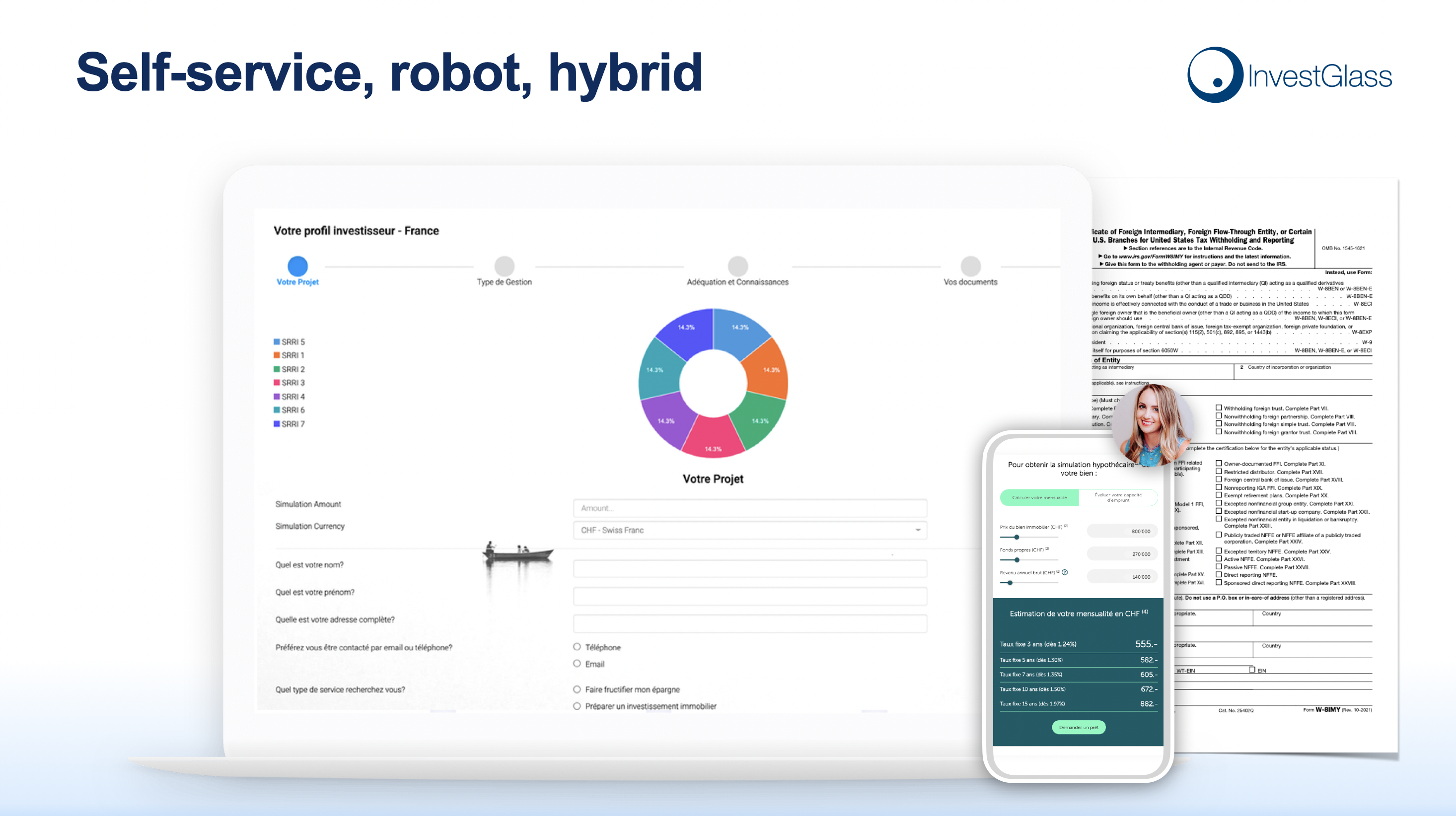
Inselartige Kundenreisen über verschiedene Systeme hinweg
Using separate tools for CRM, onboarding, portfolio reporting, and document sharing creates disjointed experiences. Clients need separate logins for different portals. Advisers retype data into multiple systems. Support costs rise as staff troubleshoot integration failures.
Example unified journey:
Data captured during onboarding, such as tax residency and risk profile responses, instantly appears in portfolio reports and compliance checks. The client logs into a single portal to see documents, performance, and messages. The relationship manager sees the same information in their CRM timeline.
An integrated platform like InvestGlass aligns the customer experience across onboarding forms, CRM timelines, and client portal dashboards. Centralising everything under one souverän platform reduces operational risk and creates a consistent positive experience at every touchpoint.
Warum die Beherrschung der UX-Grundlagen für Banken und Vermögensverwalter wichtig ist
Better UX leads to measurable benefits. Higher conversion on account openings, lower support costs, improved regulatory readiness, and stronger client retention all follow from systematic attention to how users interact with digital products.
Industry surveys from 2023 and 2024 confirm the link between digital satisfaction and assets under management. Institutions with strong digital experiences attract younger affluent clients who expect mobile apps and self-service options. Cross-border investors increasingly choose providers that respect local rules while offering smooth digital journeys.
Strong UX on top of Swiss sovereign infrastructure is a competitive advantage for European institutions that prefer not to rely on American or Chinese providers. When target audience expectations include both usability and data protection, meeting both creates differentiation that generic platforms cannot match.
Key business outcomes to emphasise:
- Onboarding completion rates above 85%
- Support call volume reduced by 30-40%
- Audit preparation time cut by 50% through logical information architecture
- Client Net Promoter Scores improved by addressing pain points identified through user feedback
- Loyal customers who refer others based on positive emotional response to digital tools
Vertrauen, Loyalität und Datensouveränität
Clients, especially in private banking, increasingly ask where their data is stored and under which jurisdiction. Since 2020, this concern has moved from technical specialists to mainstream client conversations. A deep understanding of this shift helps institutions position themselves appropriately.
Combining clear, calm UX with transparent Swiss hosting information builds long-term trust. When clients understand that their data remains under Swiss or local jurisdiction rather than American or Chinese hyperscale clouds, they feel more secure. This transparency supports a positive emotional response that extends beyond any single feature.
InvestGlass gives institutions control over infrastructure, supporting on-premise deployments when required by national rules. European regulators, including FINMA, emphasise client-centricity and data protection. Meeting these expectations through both user friendly interfaces and sovereign infrastructure demonstrates genuine commitment to client interests.
Sovereignty and user experience are now intertwined concerns, not separate topics. Institutions that treat ux as merely cosmetic and sovereignty as merely technical miss the opportunity to create products that genuinely serve user needs.
Anwendung von UX-Grundlagen mit InvestGlass als souveräner Plattform
InvestGlass provides a practical way to implement ux principles across CRM, onboarding, portfolio management, marketing automation, and client portals. The platform is built specifically for regulated institutions, with workflows that reflect actual compliance requirements rather than generic sales processes.
This contrasts with using generic American or Chinese CRM suites where data residency and sector-specific workflows may be harder to control. Non-technical teams can configure forms, workflows, and dashboards in InvestGlass to match their ux research findings without waiting for developer resources. Business goals around client satisfaction, compliance efficiency, and operational cost reduction are directly supported by the platform architecture.
Starting with a focused UX improvement project delivers results quickly. For example, optimising digital onboarding for a specific client segment in 2026, then measuring completion rates and support tickets, provides evidence to expand the approach across other user journeys.
Concrete next steps:
- Book a demo to see how InvestGlass handles onboarding, CRM, and portfolio management in one integrated environment
- Map one high-priority client journey end to end, noting current pain points and user flows
- Run a UX review workshop with relationship managers, compliance officers, and IT to identify quick wins
- Define behavioural metrics you will track before and after changes
- Review data sovereignty requirements and confirm that Swiss hosting or on-premise deployment meets your needs
Mastering user experience basics is not optional for regulated institutions competing in 2026. The combination of intuitive UX, clear information architecture, and Swiss data sovereignty creates effective solutions for both clients and staff. The organisations that treat ux as a strategic priority, not an afterthought, will build the trust and efficiency needed to thrive in a demanding regulatory environment.
UX-Design-Tools und -Ressourcen
UX designers rely on a variety of tools and resources to create user-friendly digital products that meet the needs of their target audience. Leading platforms such as Figma, Sketch, Adobe XD, and InVision are widely used for user interface design, enabling teams to develop wireframes, interactive prototypes, and high-fidelity mockups. These tools support collaboration across design teams, allowing stakeholders to review and comment on user interface elements in real time.
Beyond design software, a wealth of resources is available to help UX designers stay current with best practices in user research, usability testing, and interaction design. Online platforms like the Interaction Design Foundation offer comprehensive courses covering topics from information architecture to conducting usability tests. Blogs, podcasts, and webinars provide ongoing insights into the latest trends in ux design and digital products.
By leveraging these tools and resources, UX designers can efficiently gather user feedback, iterate on design ideas, and ensure that every aspect of the user interface is optimised for both usability and compliance. This commitment to continuous learning and improvement is essential for creating digital products that deliver a positive user experience and provide a competitive advantage in the financial services sector.
UX-Design-Karrierepfad
A career in UX design offers a dynamic and rewarding journey, with opportunities to specialise and advance as skills develop. Many ux designers start their careers with a foundation in design principles, human-computer interaction, or user centred design, often gained through formal education or self-directed learning. Entry-level roles typically involve supporting user research, assisting with visual design, and contributing to interaction design projects.
As designers gain experience, they may choose to specialise in areas such as user research, information architecture, or visual design, or progress into senior roles leading design teams. Collaboration is a key part of the ux design process, with experienced designers often mentoring junior colleagues and shaping the overall design strategy for digital products.
The demand for skilled ux designers continues to grow, particularly in regulated industries where user centred design and compliance are critical. Those who build strong portfolios, stay engaged with the latest developments, and demonstrate a deep understanding of user needs are well positioned to advance into leadership roles or establish their own consultancies. The field rewards curiosity, adaptability, and a commitment to creating user friendly solutions that enhance the end user’s experience.
UX-Design-Community
The UX design community is a thriving network of professionals dedicated to advancing the craft of creating user friendly digital products. Designers, researchers, and industry experts connect through online forums, social media groups, and dedicated platforms such as the UX Design subreddit, UX Collective, and Design Systems Slack. These communities offer a space to share knowledge, seek advice, and showcase work, fostering a culture of collaboration and continuous improvement.
Participation in the UX design community provides access to a wealth of resources, including case studies, design critiques, and discussions on emerging trends in ux design. Regular conferences, workshops, and local meetups offer opportunities to learn from industry leaders, exchange ideas, and build professional networks.
Engaging with the community helps designers stay informed about best practices and new developments, ensuring that the digital products they create remain user friendly and effective. For those working in regulated sectors, these connections can also provide valuable insights into sector-specific challenges and solutions.
Zukunft des UX-Designs
The future of UX design is shaped by rapid technological advancements and evolving user expectations. As artificial intelligence, virtual and augmented reality, and the Internet of Things become more integrated into daily life, ux designers will need to adapt their approaches to create seamless experiences across a growing array of digital products and platforms.
There is an increasing focus on accessibility, sustainability, and social responsibility within ux design. Designers are expected to consider the broader impact of their work, ensuring that digital products are inclusive and environmentally conscious. This shift requires ongoing learning and a willingness to embrace new methodologies and tools.
UX designers who stay ahead of these trends by continually updating their skills and understanding how users interact with emerging technologies will be well positioned to deliver innovative solutions. By prioritising user needs and maintaining a commitment to user centred design, the next generation of digital products will not only be efficient and effective but also meaningful and delightful for users.
Schlussfolgerung
In summary, UX design is fundamental to the success of digital products in regulated financial environments. By applying principles such as user centred design, thorough user research, and rigorous usability testing, organisations can create products that are intuitive, efficient, and enjoyable for users. The ux design process, from initial research through to prototyping and testing, demands a deep understanding of information architecture, visual design, and the specific needs of the target audience.
As the field continues to evolve, it is essential for ux designers and design teams to stay informed about the latest trends and best practices, ensuring that their work remains relevant and impactful. Prioritising user friendly, accessible, and sustainable solutions not only drives business success and competitive advantage but also enhances the overall customer experience.
Ultimately, the goal of UX design is to create digital products that are not only effective and efficient but also deliver a positive and meaningful experience for users. By embracing a user centred approach and committing to continuous improvement, organisations can build trust, foster loyalty, and thrive in an increasingly competitive digital landscape.

